Happy second day of spring, beautiful readers! Can you already feel it coming? Last year, after experiencing the season on the East Coast for the first time, I bitched and moaned that New York didn't get any spring at all - it was just bitterly cold, then grey and rainy, then straight onto summer. But you know what, this year, even though it's still rather chilly and nothing at all is blooming yet except for my house orchids, I feel the change in the air, in the angle of sunlight, in my energy levels. I'm ready for warmer weather!
Taking a page from
Gummy's book, I decided to shop my own stash for some spring-themed make-up. I'm all about the
de riguer springtime shades like pastels and peachy pinks, because they suit my fair complexion very well. Nearly all of the products featured here have been previously discussed and reviewed in detail, so... Let's just feast our eyes on some cheery product shots, shall we?
For the eyes, I obviously had to whip out my
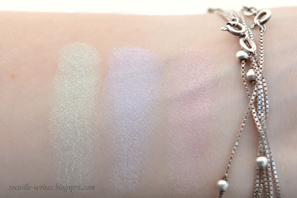
Shiseido Luminizing Satin Eye Color Trio in BL215 Static - I don't own another eyeshadow palette that's more perfect for the season than this one, and as a bonus, it can be layered over different eye bases for a variety of looks. To be completely honest, I rarely do that though; I prefer to use these shades as accents in the inner corners of my eyes or along the lower lashline. I basically plan to use
bareMinerals Eye Color in Celery,
Fyrinnae Electric Stardust and When I Grow Up, as well as
MAC Satin Eyeshadow in Heroine, a beautiful periwinkle blue, in the same way, or to add interest to a pencil eyeliner, like the
NYX Slide On in Pretty Violet, on the upper lashline.
Laura Mercier Caviar Stick in Sugar Frost can add some dimension via its angelic champagne sparkle to any eye look I decide to create.
 |
| L-R: Laura Mercier Sugar Frost, NYX Slide On in Pretty Violet, Fyrinnae When I Grow Up, MAC Heroine, Fyrinnae Electric Stardust, bareMinerals Celery |
Nothing groundbreaking on the lips, but I was happy to be reminded of the gorgeous texture of
Shu Uemura Rouge Unlimited Supreme Shine in PK331 and the
Giorgio Armani Rouge d'Armani Sheers in Coral, both sheer, lightweight, comfortable, glossy formulas. To balance out the high-end stuff, I also threw the
Covergirl Lip Perfection Jumbo Gloss Balm in Watermelon Twist into my current make-up basket. Since all of these products give off intense shine on the lips, I didn't really need a gloss, but I always enjoy wearing the
Clarins Instant Light Lip Perfector in Rose Shimmer.
 |
| L-R: Covergirl Watermelon Twist, Clarins Lip Perfector in Rose Shimmer, Shu Uemura Supreme Shine PK331, Giorgio Armani Sheers in Coral 301 |
For blush, I was really feeling
The Face Shop Pastel Cushion Blusher in Coral Cushion and the
NYX Powder Blush in Pinky. The first is a bit too sheer, the other a bit too pigmented, but the effect of both once applied is that of a youthful, glowy cheek. No arm swatches, because... lazy.
 |
| The consequence of taking these extreme face close-ups is not only realizing you have stray brow hairs that need plucking and freckles even on your browbone, but also feeling the odd detachment of your own face looking alien to yourself. |
For this Face of the Day, I kind of took the 'all the things, all at the same time' approach to feature as many products as I could combine in action, but on a normal day (who am I kidding, what is a normal day?!), I'd only reach for a couple of products from my spring palette and pair them with some boring neutrals. For the eyes, I used Laura Mercier Sugar Frost on the lid with some lighter brown to add definition to the crease, and lined my upper lashline with a dark eggplant eyeliner (Urban Decay Rockstar from my
Project Make A Dent), layering NYX Pretty Violet over the top on the inner half of my eyes. I love how that turned out!
On the lower lashline, I combined MAC Heroine and Fyrinnae When I Grow Up, with Electric Stardust in the very inner corner. The rest of my face is a standard base of Face Atelier Ultra Foundation in Procelain set with MUFE HD Powder (Project MAD again), some light bronzing courtesy of The Body Shop Honey Bronzing Powder, NYX Pinky on the cheeks and Shu Uemura PK331 on the lips. Clearly, I don't match my make-up to my outfits, because all of these cool tones look rather clashy against my red sweater. ANYWAY.
Which products out of your make-up stash do you always bring out for spring? Have you bought any pieces from spring collections this year? Or do you abhorr pastels and impatiently look forward to the warm summer shades?